A closer look at Apple's breathing light
If you own a Mac Book you’ve probably noticed the “breathing light” that starts pulsating when the lid is closed. There’s something soothing and organic about its undulating rhythm. It turns out, perhaps unsurprisingly, that Apple has put much thought into this design, filing a patent in 2002 with the intent of achieving a psychologically pleasing sleep indicator that’s capable of saving on battery power. It’s a great example of how to balance form and function.
Internet lore claims Apple modelled their design after much research into sleep breathing rhythms. This piqued my curiosity, how did this wonderful little light work and how true was it to human breathing?
Breathing Rate
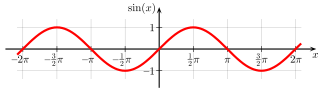
A good place to start is with the most obvious, the three steps of breathing familiar to everyone-inhale and exhale-repeated in a wave-like pattern. The most obvious mathematical pattern this evokes is a plain sine-wave:
So, let me start there, here’s what a positively biased sine wave based breathing pattern looks like with 1.8 seconds periodicity and a 0.4 second pause (as in Apple’s patent) in between breaths.
Not bad, but clearly too fast and sharp breath-to-breath transitions. What if I slowed down the simulated breathing down? (period of 5 seconds and 0.4 second pause):
Better, but transitions between “breaths” (waves) are still too sharp. I was able to get slightly better results by experimenting with other modified sine wave functions such as 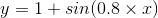 but ultimately the end result wasn’t quite right, indicating that a purely sine-based pattern is incorrect. An examination of Apple’s patent offers a clue via an included figure (below), showing the light intensity pattern over one “breathing” cycle of the LED.
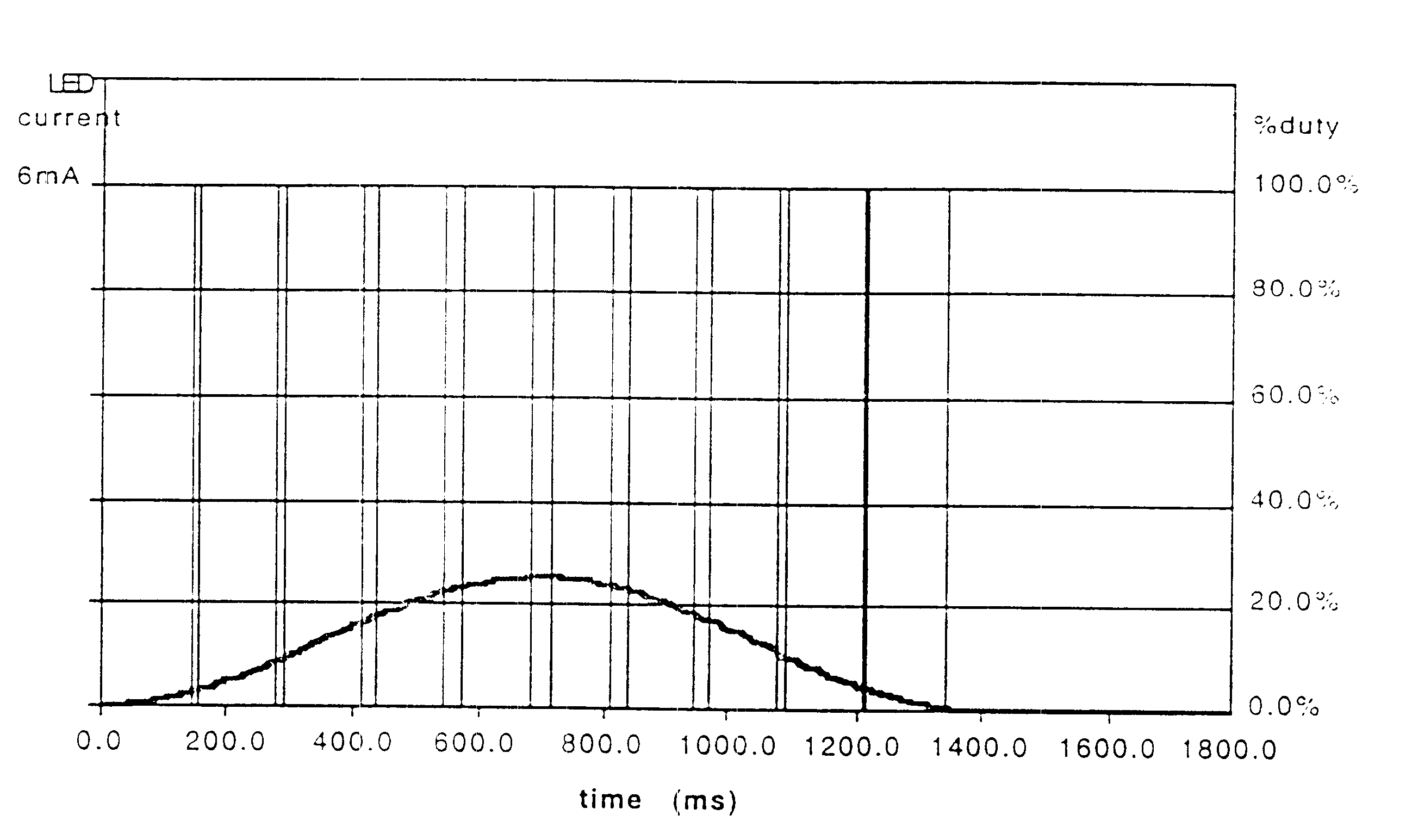 Figure 3 from Apple patent description.
Two quick observations right away: first, the preferred “breathing” periodicity is given as 1.8 seconds, but this yields approximately 33 “breaths” per minute, an unpleasing hurried pattern, at odds the measured rate on my Mac Book at a more pleasant 12 “breaths” per minute - the lower bound of the average respiratory rate for an adult at rest.
Second, being a healthy adult, sitting at rest typing this, I’m able to tell my breathing pattern isn’t perfectly symmetrical as above, although it’s a perfectly intuitive selection to model it. Perhaps these were decisions made when the patent was filed and later changed due to user feedback.
Now, a bit of the science. In medical lingo, the terms for breathing in and out are inspiration and expiration, respectively. The volume of air that you draw into your lungs as you breathe is known as the tidal volume. Inspiration is slightly quicker than expiration due to increased airway resistance which slows down the air flow. Healthy and regular airflow never actually stops, for obvious reasons.
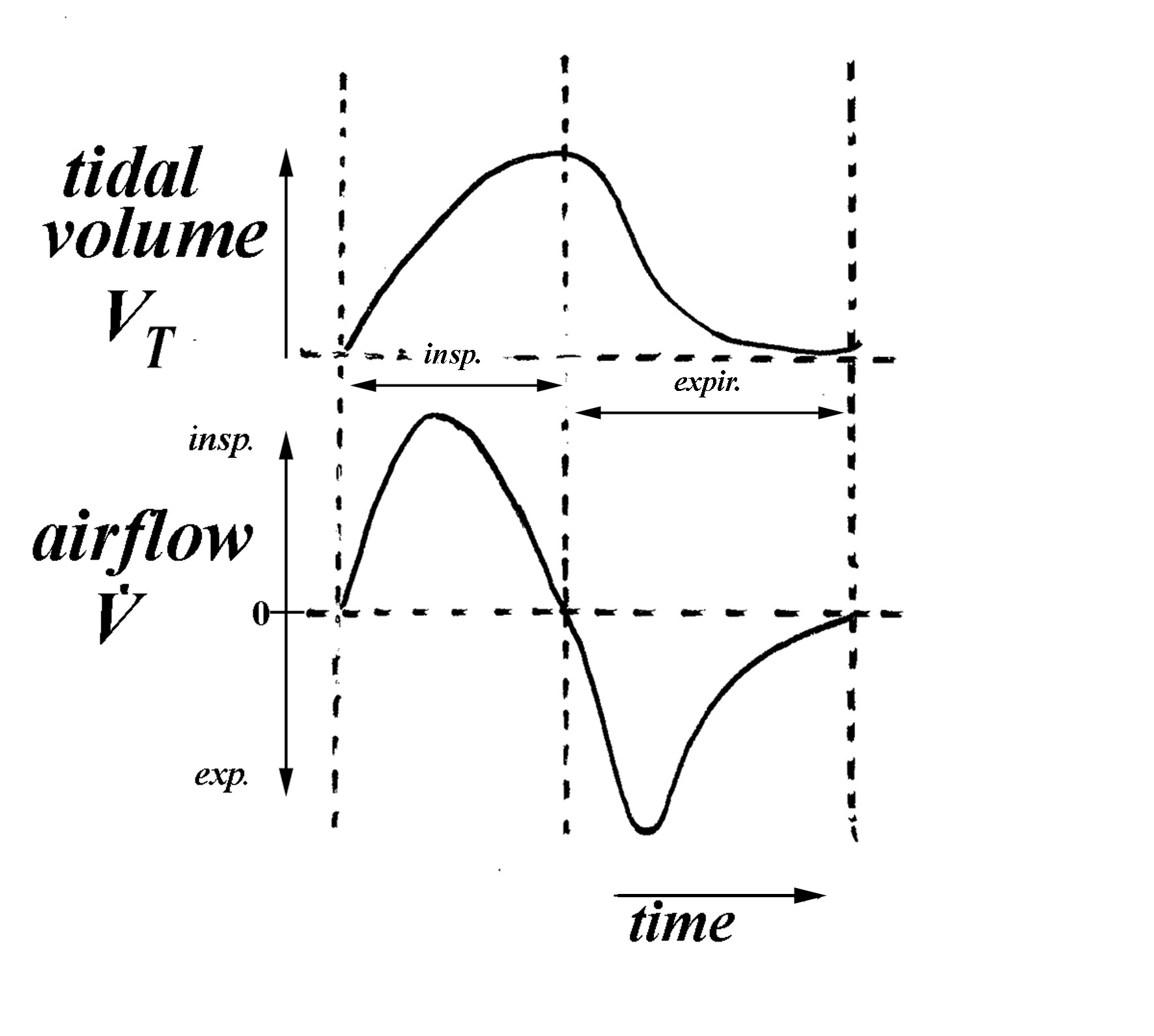
The ratio between inspiration and exhalation (or I:E ratio) varies with many variables such as gender, age, weight, fitness levels, and medical conditions. However, for a healthy adult this ratio ranges between 1:1.5 and 1:2. There’s a series of interesting videos explaining respiratory function and principles of mechanical ventilation where these concepts are discussed in more detail.
Obviously neither the actual airflow diagram nor the concept of I:E ratio match up with the symmetrical pattern Apple’s is describing. Maybe the real pattern is unnecessarily complex for what Apple wanted to achieve, or maybe there were other considerations?
Light Intensity
The brain processes sensory information from the eye in discrete chunks, if those chunks are presented quickly enough we perceive them as continuous, too slow and we perceive them as blinking (persistence of vision). For an LED the boundary between too slow and fast is around 50Hz, so Apple’s attenuation of a duty cycle ranging from 100-200Hz would result in the desired effect of controlling the brightness without seeming like blinking. In terms of the ideal brightness there isn’t much to discuss here beyond Apple’s subjective setting. They’ve selected a duty cycle peaking at around 25% to avoid being too bright, an issue with earlier Mac Books that resulted in brightness disruptive to people trying to sleep.
Although the peak light intensity is subjective the eye’s response to light levels until it’s reached is more definite. Humans are fantastically adapted to detect small changes at low light levels, but require larger changes in high light levels. Eye brightness response is an extremely complex topic beyond the scope of this post but the bottom line is that it’s not linear and is best approximated by a power or logarithmic function. This means a gaussian curve (think about the rate of change or the first derivative) would be a better choice than the simpler sine wave.
There’s excellent further discussion on on the topic of eye sensitivity to light levels at http://www.telescope-optics.net/.
Colour selection
Finally, does the colour of the LED make any difference? Now, I won’t pretend Apple selected the colour based on some deep scientific reasoning as the colour fits squarely in their design language and is a natural complement to the the chic aluminum case. But, I do have a few thoughts on this issue.
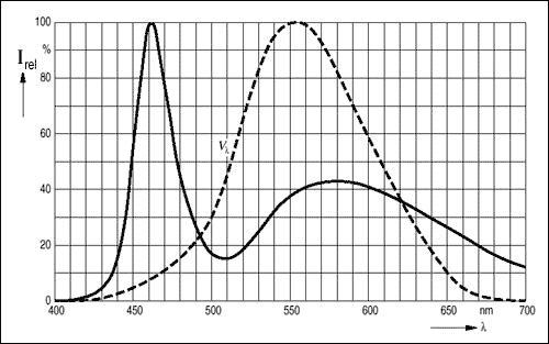
Eye spectral response is directly related to light intensity through the level of activation in cones and rods. Generally speaking, vision in low light conditions (scotopic vision) is achieved exclusively through rod cells whose sensitivity range is to light with wavelengths between 498nm and 640nm (green/blue to red) as the cone cells in the human eye become nonfunctional. The CIE organisation has devised a standard to describe this average spectral sensitivity to brightness and represents it using the luminosity function.
The reason this is important is because white doesn’t appear in the spectrum as a colour, it has to be “created”, a trick of perception achieved through mixing real (spectrum) colours. So sensitivity to individual colours as modelled by the luminosity function makes a big difference. White LEDs like the one in the Mac Book are made from semiconductor material called Indium gallium nitride (InGaN) that emits blue light, it’s covered with another material that emits yellow light when stimulated by the blue light. The resulting mixture is perceived as white.
During photopic vision, you’re most sensitive to light that appears greenish-yellow whereas in scotopic vision to light which would appear greenish-blue. Since white LEDs actually have a blue “base” they’re a good choice for an LED aimed at dark environments (eg: around sleep time), at least from a luminosity perspective.
That being said, blue light is not conducive to sleep as our bodies and brains have evolved to associate blue light with daylight over eons. Blue light regulates the secretion of the sleep hormone melatonin, more blue light limits its production and we stay awake longer. Since white light is actually an optical illusion based on blue light, we’re constantly bombarded by wavelengths near those that suppress melatonin production. However, it’s extremely unlikely the LED’s tiny amount of light would interfere with sleep.
All-in-all, on top of being an ideal design colour selection, a white LED is also a scientifically sound choice.
Analysis
Now that I had some understanding of the science I decided to measure the actual brightness pattern of the Mac Book LED for myself. I didn’t want to use a photocell as they’re less sensitive and can vary significantly with temperature. Instead, I used a high speed and sensitive silicon PIN photo diode in a miniature domed plastic package to create a simple voltage divider. More light shining on the photo diode means reduced resistance (more voltage), and less light means more resistance (less voltage).
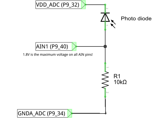
The output of the voltage divider above was fed into channel 1 (AIN1) of a BeagleBone Black (BBB) which was already sitting on my desk, configured for another project. The BBB has a single 12-bit ADC converter with 7 available channels, a max sampling rate of 200k (AM335x ADC), and convenient 1.8VDD and GND pins via the P9 header. I rigged the photo diode to a small stationary platform and brought it into contact with the Mac Book’s breathing LED. I cut a plastic cup to cover the sensor and LED area creating a make-shift light shield, turned off all the lights, and collected samples.
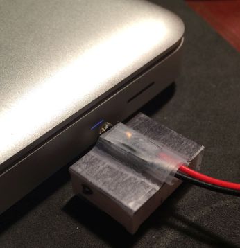 Photodiode rig
I used the Adafruit BBIO module and this trivial code snippet to collect the samples:
import Adafruit_BBIO.ADC as ADC
import time

ADC.setup()

# 3000 samples with 10ms delay in between
for samples in range(0, 3000):
    vol = 1.8 * ADC.read("AIN1")
    print vol
    time.sleep(0.01)
I did this with different timings, for example, here’s the 10ms data plot:
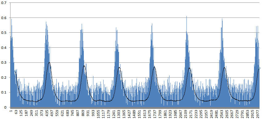 Approx 3000 samples at 10ms intervals; Vertical axis is recorded voltage, horizontal axis is sample number; black line is moving average with a period of 60.
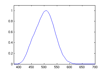
I picked up some PWM artefacts which I smoothed out with a low-band pass filter in the form of a moving average. Another approach could have been to do logistic-regression which would have been more sensitive to the peaks in the data. But, a moving average was simpler and I was more interested in the overall shape. The cleaned up pattern looked like a gaussian with potential pause periods in between. I isolated a single full peak and used SciPy to try and curve fit a gaussian to it to confirm.
You’ll need to install SciPy for this:
import pylab as plb
import matplotlib.pyplot as plt
from scipy.optimize import curve_fit
from scipy import asarray, exp, mean, sqrt, loadtxt, pi
def moving_avg(data, period):
new_data = []
for i in range(0, len(data) - period - 1):
new_data.append(mean(data[i:i + period]))
return new_data
period = 53
y_raw = loadtxt('led-10ms.txt')
y_ma = moving_avg(y_raw, period)
x = asarray(range(len(y_ma)))
y = asarray(y_ma)
# Starting points for minimization
n = len(x)
# Discrete mean and variance of random variables
mean = sum(x * y) / n
sigma = sqrt(sum(y * (x - mean)**2) / n)
# The probability density function of the normal distribution
def gaussian(x, mu, sigma):
t = (x - mu)**2/(2*sigma**2)
f = 1. / sigma * sqrt(2*pi)
return f * exp(-t)
def graph(x, y, y_fix = 0, factor = 1):
g = gaussian(x, *popt)
plt.plot(x, y, 'bx', label='data')
plt.plot(x, (g * factor) + y_fix, 'ro', label='fit')
plt.legend()
plt.title('Gaussian fit')
plt.xlabel('Time (s)')
plt.ylabel('Voltage (V)')
plt.show()
# amp_correction tweaks 1/sigma * sqrt(2*pi) factor, which
# assures the total area under the curve generated by the pdf is 1.
# We can ignore that, we're only interested in the overall shape.
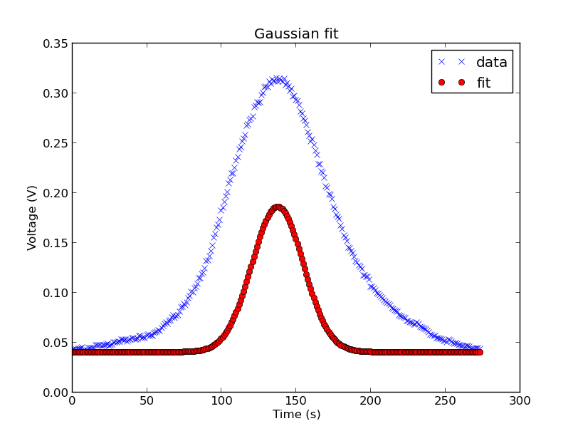
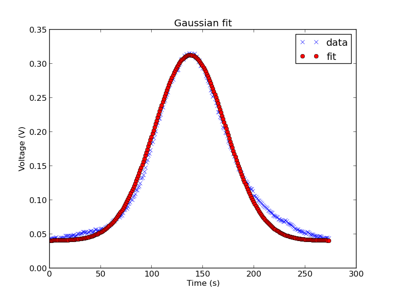
popt,pcov = curve_fit(gaussian, x , y, p0=[mean, sigma])
# Regular gaussian nudged up a bit
graph(x, y, 0.04)
# Increase sigma to widen the curve
popt[1] = 35
# Graph again and manually adjust factor
graph(x, y, 0.04, 3.8)
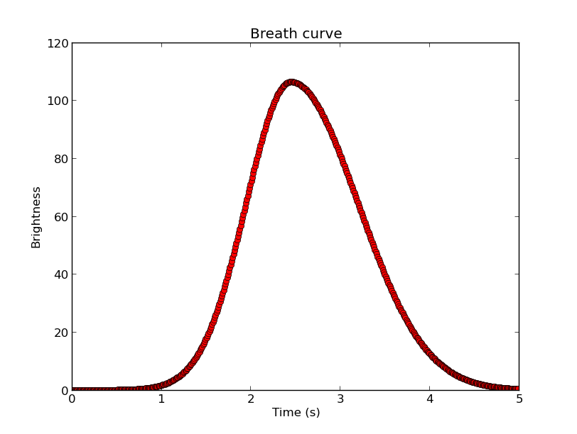
Optimal values for the parameters so that the sum of the squared errors is minimized are: mean=18.045 and sigma=48.033
The first graph shows the smoothed data (blue) and a fitted gaussian nudged up a bit. Once I saw the shape was correct I applied two small corrections: first, I adjusted the factor that assures the total area under the PDF curve is 1, as all I’m interested in is the shape, this fixed the height and and some of the tail issues. Second, I narrowed the curve by manually decreasing the standard deviation to 35. The result is the second graph, as you can see, an extremely close fit.
Resulting in the formula:

The actual values aren’t important as proving that the shape is gaussian. Obviously the generalized form of above is the pdf for the normal distribution:
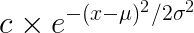
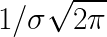
where the factor “c” would normally be:
Referring back to the initial duty cycle figure from the patent, it’s possible to guess that it would be a gaussian (mostly from the tails) but it’s more satisfying to know for sure this way. Although the pattern I measured is a close fit, it’s not perfect, the drop on the right side of the curve looks slower than the rise on the left side, but this could be measurement error.
Putting it all together
To test out my code I used a tri-colour LED that I connected to the BBB’s PWM pins through resistors so I could experiment with different colours and blends.
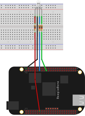 Circuit to test my breathing LED code
The real brains of the operation is the software. I settled on using a piecewise function to get the desired effect, not as complex as the actual breathing pattern of a human but at least true to the I:E ratio and brightness transitions required. The final function is composed of two halves of different gaussian curves: the first half would be a regular gaussian with the parameters fit above. The second half would be a wider gaussian with slower fall-off that would take advantage of the asymptotic nature of the function such that we would get an appropriate pause-like pattern in between breaths.
To do this I shifted the first gaussian curve to that its domain starts at 0 and remains positive. Since the time domain is 5 seconds total and the I:E ratio is known, it was trivial to pick the split point and therefore the mean. By manipulating sigma I was able to get the desired up-take and fall-off curves; by manipulating factor “c” I was able to control for peak intensity. I tried sticking to what I’ve learned but any values you think makes the curve look right in shape are fine, just just don’t try to do any statistics with the resulting function.
Once the curve was created it looked like this:
In some environments fixed-point calculations perform better, previous experience has led me to believe this is true on the BBB, so I generated a lookup table with the curve values. This lookup table acts as unity, you can scale it to whatever duty cycle you’d like with basic arithmetic operations.
I then set the PWM frequency to 1000Hz as 100-500Hz looked very “chunky”, another discrepancy with the patent description. The data was trimmed to 3 decimal points as values around 0.01 turn the LED off completely. Trimming the the number of decimal places can also help save on memory or if your device is only capable of fixed-point math.
Here’s some code to use the BBB PWM’s output:
import Adafruit_BBIO.PWM as PWM
import time

# Map the LED pins
blue = "P8_13"
green = "P8_19"
red = "P9_14"

# Simple range() substitute
# that allows float steps
def float_range(start, end, step):
    while start < end:
        yield start
        start += step

# Lookup table for a single "breath" cycle
# generated using f=38, sigma=0.53
vals = open('lookup_table.txt').read().splitlines()
lookup_table = [float(i) for i in vals]

# Used to scale values as we iterate
max_val = max(lookup_table)

# Duration of one breath in seconds
one_breath = 5.0

# How long to pause in between value changes
tick = one_breath/(1.0 * len(lookup_table))

# Max brightness in percent
max_brightness = 25

# PWM frequency in Hertz
freq = 1000

PWM.start(blue, 0, freq)
PWM.set_duty_cycle(blue, 0)

while True:
    for i in lookup_table:
        intensity = (i / max_val) * max_brightness

        PWM.set_duty_cycle(blue, intensity)
        time.sleep(tick)
And last but not least, here’s the output (try not to fall asleep):
So, there you have it, a natural looking breathing pattern for the LED!
Conclusion
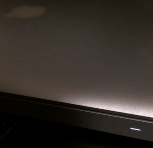
The breathing light is a beautiful design that balances form and function. Yet Apple continues to innovate even on this seemingly irrelevant part of the laptop. Newer models of the Mac Book have done away with any indication there’s even an LED, no slits or holes, but simply light glowing on the smooth aluminum surface. This bit of magic is called “Invisible, light-transmissive display” and is achieved through use of a laser to bore through the outer edge of the case, not quite enough to create a hole, but enough for the light to shine through.
The kind of ethos that drives this design, iterating constantly towards humanizing computers, is what I greatly support and think Apple has managed to achieve with this little feature, I hope my posting has given some insight into that process.
Use this in a cool project? Spotted an error? Say hi, let me know! Drop me a line at hello@avital.ca